


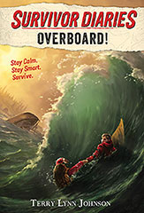
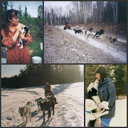
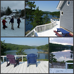
Need a little help deciding on a business card. Here's the front/back of my top picks. I've been reading too many rules of what to include and what absolutely not to include and now I'm frozen with indecision. Would appreciate any comments, good, bad or ugly.
Proofs come from http://www.vistaprint.ca/vp/ns/












6 comments:
I'm not sure if you really need the photo (or if you need to go double sided) but I quite like the front card in the second set - the one with the misty green.
Thanks for the quick response Kathleen! I thought I'd add the photo to sort of show what I write (mostly about dogsledding)But I wondered if it looked too real-estate-ish.
the last one. i never turn a business card over.
we decided on Cody Backhoe White today.
thanks for the great tips on dogs today too!
I like the second one also. If you MUST put something on the back, don't center it. Move it to the left edge. That leaves space for you or the person receiving it to make notes.
MaryMumsy from AW
I also like the second set. It's easier to see your name on it than on the first one. And you can decide whether or not you want to add the picture. I opted for double-sided because it fit with what I wanted for my cards. You could consider making your tagline a bit longer and not doing the picture: Writing outdoor adventures about dogsledding. Just a thought.
I like the last one with the photo of you and the dog the best, that card caught my attention and held it longer than the other two, which are nice as well, good luck
Post a Comment